CRM software MailingCube – UX/UI Design
Mailing Cube
Sending newsletters, text messages, setting up online surveys and much more
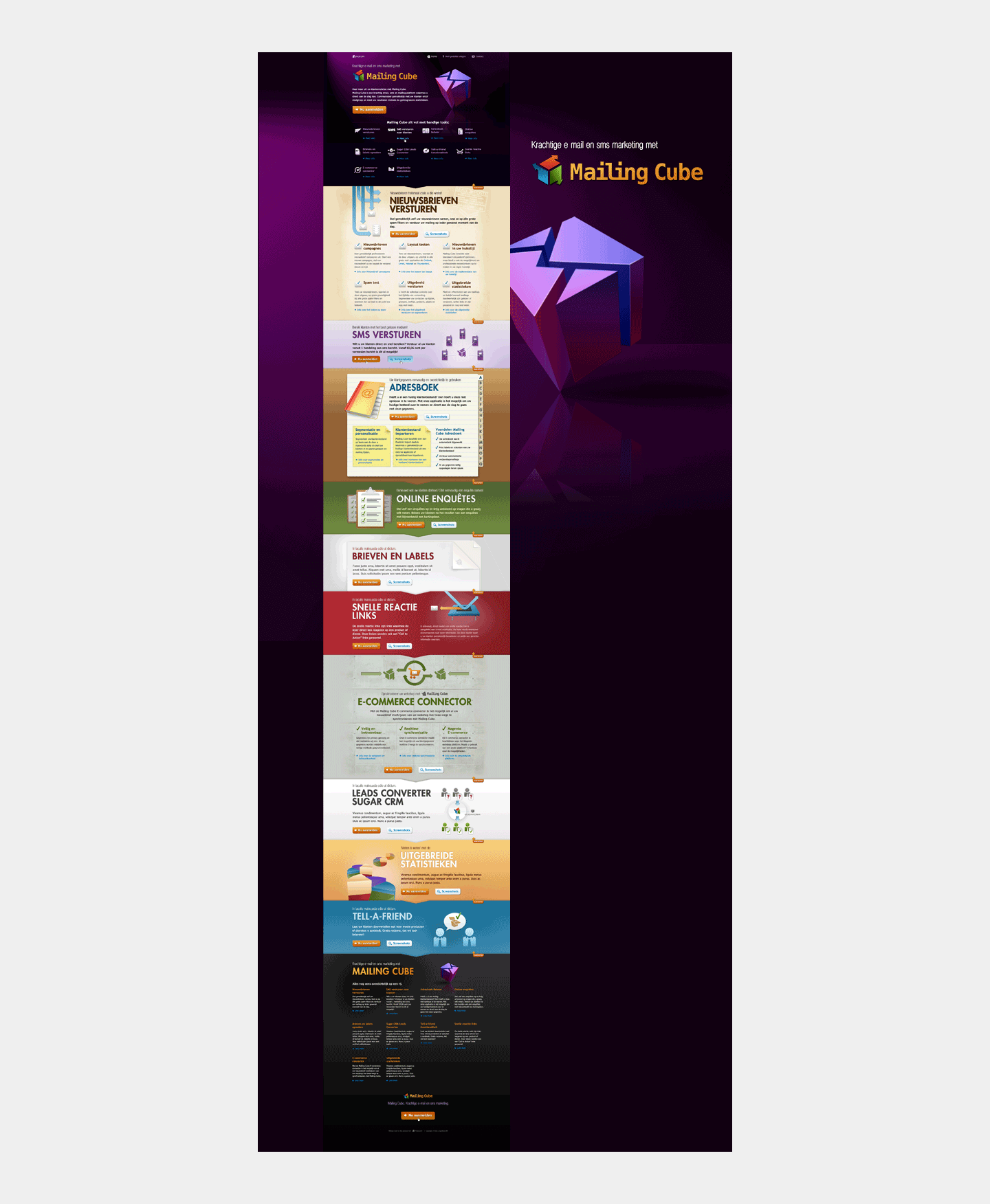
The new service was called the 'Mailing Cube'. And was in fact a Customer Relations Management (CRM) tool; a set of different functionalities such as sending newsletters, text messages, setting up online surveys, an e-commerce connector and a Sugar CRM Leads Converter. Many different functionalities in one UX/UI Design made this quite a challenge. Fortunately, I was allowed to go wild with Visual Design.
Online corporate identity based on a cube
One Page Website Design
This specific project for Synocom (I did several) was primarily aimed at developing a One Page webpage. Designing an online corporate identity was therefore unfortunately a 'side business' and there was actually no room for it in the budget.
E-mail
Because a logo / logo was needed anyway, the creative concept was kept simple. The brand identity was built around a 3D rendering of a cube. And because the range of services was based on all kinds of e-mail functionalities, it became a cube in the form of an e-mail icon.
Purple
At the time, Synocom had purple as one of the most important house style colours. That color is copied into the cube. Rob Wiek indicated that he had in mind a dark site. That dark background represented the dark, opaque CRM market. In which MailingCube was a bright spot.
Art direction
Rich, complete and saturated
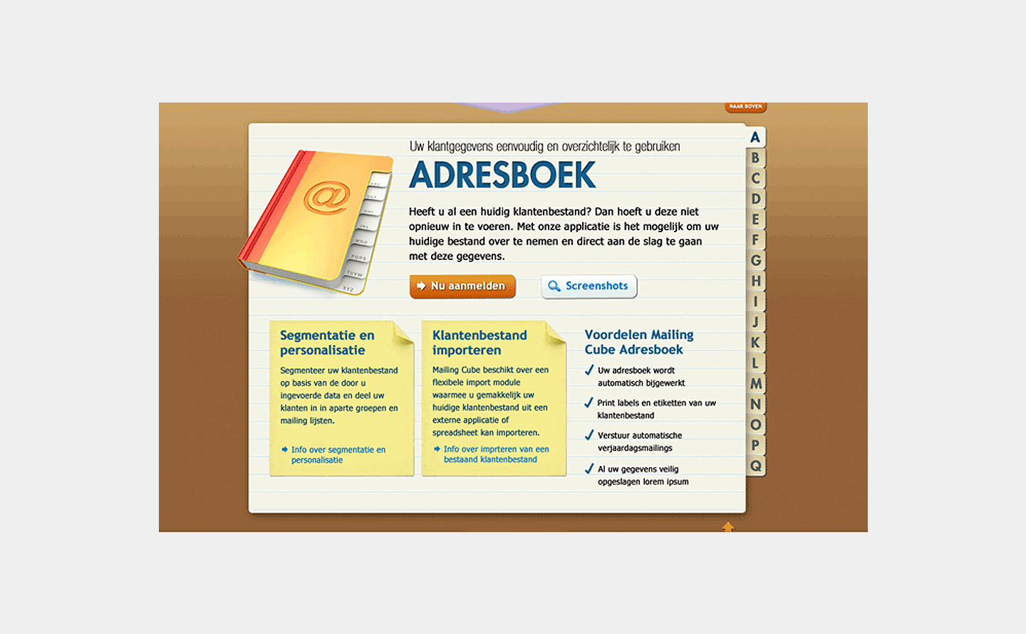
Because the Mailing Cube CRM software contains a multitude of CRM services and data, we decided to emphasize exactly that. A rich color scheme was therefore chosen. Supplemented with striking light.
Lots of great colourful images
The traffic to the site would not necessarily come from organic but from other sources. That is why it was decided to use large visuals. Large colourful graphics placed seamlessly under each other.
Need help with your UX/UI Design?
Feel free to contact me! I'd love to help you with your UX/UI design.


