GeenCash UX-UI Design multiple applications
GeenCash is a new Dutch payment platform. It uses Location Based service(s) used to facilitate financial transactions without physical money. Based on the current location of the buyer and seller, both parties are linked to each other through GeenCash for the duration of the transaction. It is not necessary to share personal data, such as telephone number or e-mail address.


Need
Brand Identity Design and websites
GeenCash placed an appeal on a website where many assignments for freelance designers are placed. In it they indicated that they needed a Freelance UX/UI / Graphic Designer. After the first, pleasant acquaintance it was decided to work together on the new Brand Identity and website’s.
Challenge
The main challenge of GeenCash was that nothing had previously been developed or documented in the field of visual communication. And although it was clear that GeenCash fell into the 'payment apps' category, GeenCash is so unique that there was little comparison material available.
Strategy
Not one but two websites
GeenCash needed two websites. One website to promote the mobile website. And a mobile version that allows users to transact on the go.
The layout of both sites is completely different. The mobile website 'feels' like an app to users. There is also no desktop version of it. Because if a user surfs to the same website with a desktop computer, it will arrive at the marketing website. You cannot pay with the desktop version. However, a seller can manage his products in a back-end section.
The strategy for designing a website was therefore quite simple in this project. First of all, we started with the mobile version, the 'app'. The desktop version followed after that.


UX Design – Information Structure
And as with any website design, we started with the information structure. Not only is it determined what the site navigation will be, but also what the 'happy flow' will be. The 'happy flow' is the customer journey that is most positive; without any problems to the desired end result for the user.
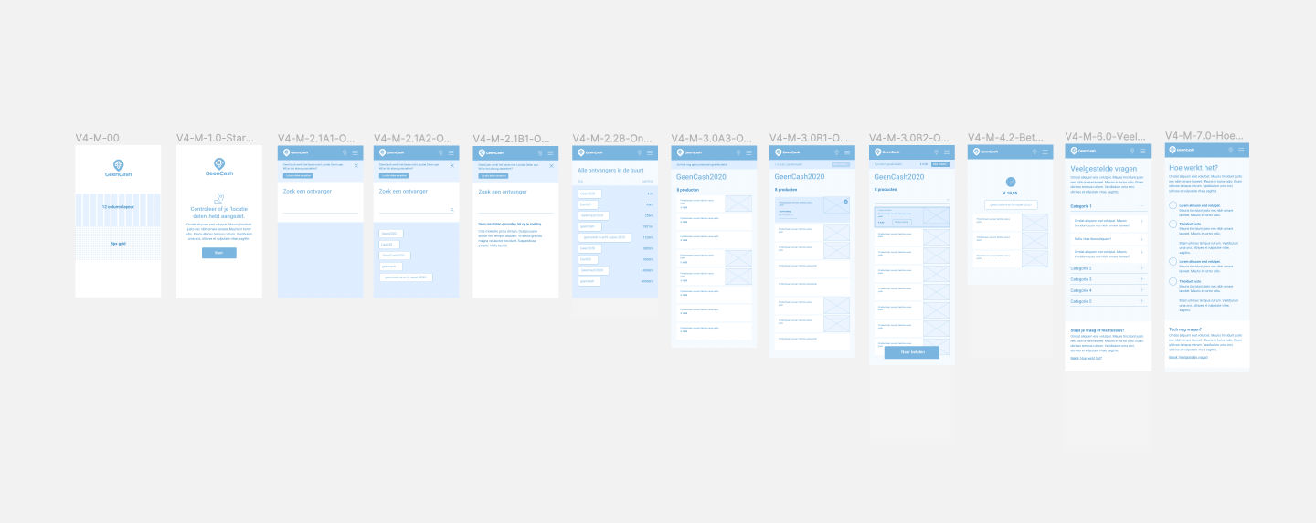
UX Design – Wireframes
Subsequently, the various templates are elaborated in Wireframes. This blueprint or 'map' of the web page shows whether there is a button, image or text somewhere, but not what they look like. So without color. Without proper typography or shapes. The great advantage of this method is that thinking processes are separated.
When designing wireframes, it is examined whether the right information is on the right page. So whether the user finds the interface and the information logical and will understand it. In the case of the GeenCash mobile website, whether the user can easily purchase and pay for a product.

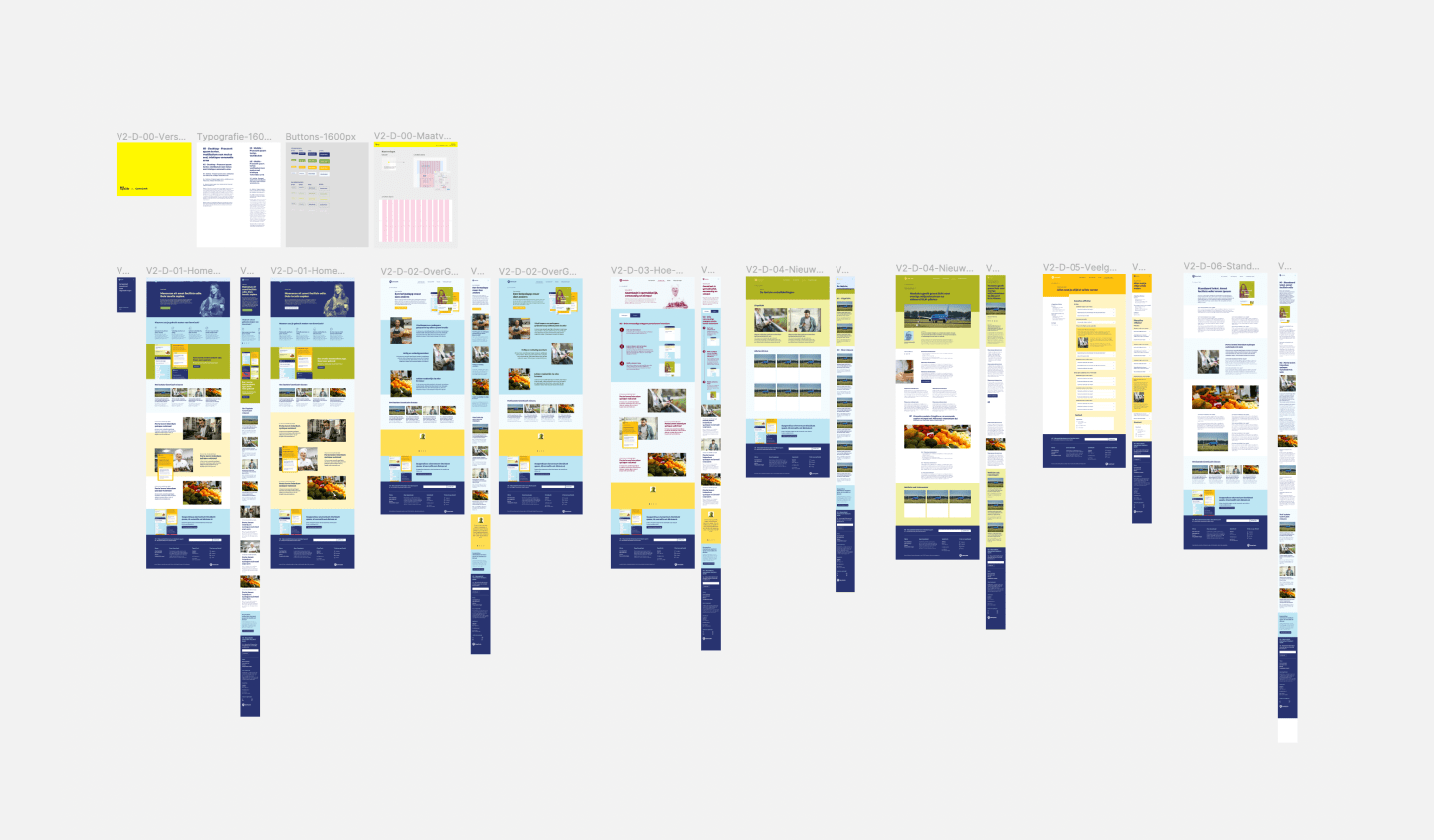
UI Design – Visual Design
When designing the next step, the visual design, the function (wireframes) is combined with attractive colours and typography. In the case of GeenCash, this meant the cheerful colours, images of products and the typography that had been determined earlier in the design process of the corporate identity.


Need help with your UX/UI Design?
Feel free to contact me! I'd love to help you with your UX/UI design.