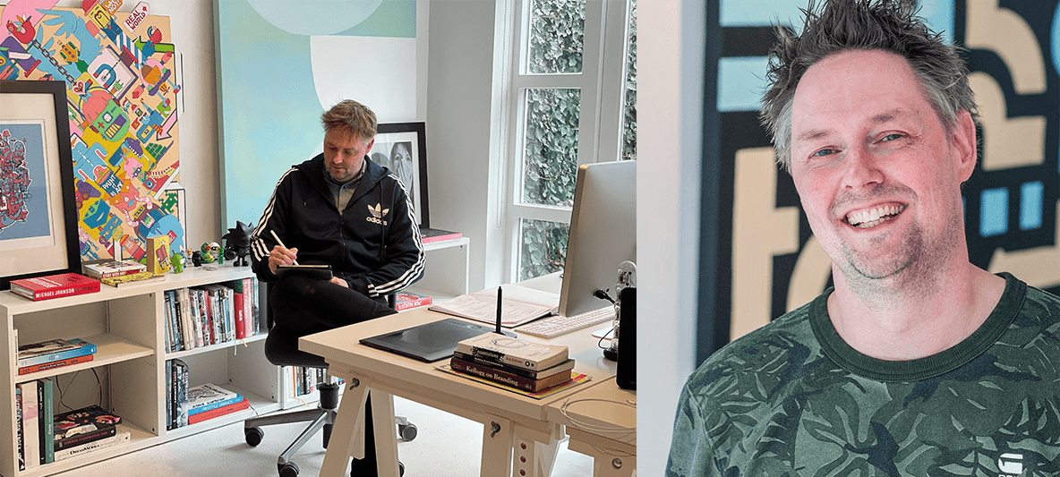
Mr. Upside x Groen van Prinstererschool
My daughter and son both attend the Groen van Prinstererschool primary school in Voorburg, the Netherlands. In the 2021-2022 school year, the school celebrated its 90th anniversary. In February 2022, Mr. Upside was asked to provide the logo and visual communication for the 90th anniversary.

Client(s)
Services delivered
Brand Identity Design
Art Direction
Communications Consultancy
Previously, Mr. Upside provided the graphic design of a flyer for the school. This served as an invitation to the party on the occasion of the relocation back to a newly renovated school building. When the primary school needed a visual style for all communication around its 90th anniversary. Mr. Upside / Michiel Nagtegaal was approached to provide the design of that visual style.
Problem / challenge
Usually the visual communication of an event or campaign, such as an anniversary, contains graphic elements from the corporate identity design of the owner of the event.
However, in the case of the Groen van Prinstererschool primary school there was no corporate identity. There was a logo. And a pay-off: 'Where we grow together'. But no unique typography, colours, shapes or images. There was also no corporate identity brand guide available.

Creative Strategy
During the entire school year, the Groen van Prinstererschool primary school celebrated its 90th anniversary with activities such as a party and a sporting event. In order to make the communication around these activities recognisable, a visual style had to be designed.
Embracing the design
Because the school did not have a corporate identity, there was a lot of freedom to come up with ideas. Mr. Upside determined that the visual style would be a success if the students recognised the communication around the lustrum and 'embraced' and used it.
Target group
The primary target group was determined to be the children of the school. Parents, employees and external parties would also be recipients of the communication, but the celebrations of the lustrum were mainly intended for the children of the school.
6-step process
The creative strategy consisted of six steps.
-
If you don't know where you come from, you can't determine where you're going. Research is therefore always an important part of the Mr. Upside Brand Identity Design process.
In this case the research for this project was limited because being a parent of two kids at the school gave me a lot of background info.
-
In Step 2, creative contextual frameworks were determined. Such frameworks help in the assessment of ideas. They also ensure a more efficient and smoother creative process.
-
After that, concept pillars were defined. These pillars form the foundation of the creative concept.
Where the creative frameworks determine the outside boundaries, concept pillars form the inside parts of the creative concept.
-
A logo or corporate identity without a creative or visual concept is an empty shell, nothing more than a pretty picture.
In this case the creative concept ensured the cohesion between the various means of communication and the thorough substantiation of design choices.
-
Many ideas for the logo were generated based on all the information from the previous steps. Out of the many ideas, Mr. Upside itself had already made a first selection.
Due to the short deadline and the confidence in the design expertise of Mr. Upside, one logo was eventually introduced to the school. A color palette, typography, an image concept and graphic shapes were also presented. Together they formed the visual style of the lustrum.
-
This visual style was then translated into examples of a number of possible means of communication, such as posters, a newsletter, t-shirts, a beach flag and a tote bag.

Art Direction and design
Step 1 - Research
Three cartoon characters
The current logo consisted of children's drawings, made by the children themselves. My daughter Zoë explained to me that each of the three figures was drawn by a part of the school. The first figure represents the first three levels in the school. The second for the three middle levels. And the third cartoon character for the highest two levels.
Step 2 - Creative frames
For children. Not for adults.
This is important. Because the design had to appeal to a young target group (up to and including 12 years old). The style should therefore not be too complex, but rather simple and simple. I wanted students to be able to actively work with the house style themselves. The children had to be able to draw the logo.
Within the existing house style
Even though the existing house style was minimal, a reference to it in the visual style of the lustrum was desirable. The current logo consisted of a children's drawing. Therefore, an authentic, self-drawn logo would be preferable.
Also a celebration of the past
With a birthday you celebrate that you have become another year older. You look forward to the new year, but at the same time, back to the previous years. The history of the primary school's ninetieth birthday was therefore important.
And although the history of the school only started for the kids themselves a few years back, when they arrived at school, it is interesting to look much further back and tie the anniversary to a nice history class.
Step 3 - Concept Pillars
Personal
I wanted the target audience to 'embrace' the visual style. That the visuals ensure that the children where involved in the birthday. And that they literally ‘owned’ the visual style. It was therefore desirable that the children could do something with the logo themselves. The logo had to be able to facilitate that every student could give it a unique creative interpretation.
Looking at 90 years
During the lustrum year there were a large number of moments when you had a chance to look at the past 90 years. A look at 90 years of history, literally. And you looked ahead. Considering this, looking was an important pillar, an important foundation under the creative concept.
Positive setting
Although the Covid pandemic has given a completely different meaning to the concept of 'positive', the birthday is something positive, a party, and something cheerful. The logo should be permeated with positivity, festivity and cheerfulness.

Step 4 - Visual concept
The creative, visual concept was based on a '90' shape. Drawn by a child. The shape represented eyes as a reference to Concept Pillar 2 'Looking at 90 years'. The number forms could also be filled completely and serve as a mask for an image. With the "exclamation" stripes also be sun rays or eyelashes.
Simple and powerful
The symbol is simple and powerful yet triggers the imagination of kids. It also is versatile in its use.
Step 5 - Design of the logo
The hand-drawn shape was set up as a digital illustration on an Apple Pad. The hand-drawn aspect communicates that it is a personal party. A birthday that revolves around people (not things). A birthday experienced by a child (student). Because the lustrum is for and by children.
Eyes
Eyes, if you recognise them in the shapes. Because having eyes in something makes it funny and cheerful and positive. And also because the lustrum is a look at time. They can also be filled (or almost filled) so that the shapes can be masks for photography or illustrations. Or drawn or coloured by children.
Exclamation lines
The exclamation marks (or eyelashes or sun rays) make it even more positive. But at the same time even more of a face. And the tail of the nine is the line that everyone has under their eyes.
Typography
In every brand identity design, the typography is carefully considered. After all, much communication takes place via text. And the way this text is formatted can make or break a message. Naturally, the same frameworks and pillars apply to the selection of the typography as to the creative concept.
Freedom
Normally, at an event, the first thing that I look at is the corporate identity typography of the organisation that organises the event. In the case of this primary school, no typography had been defined in their brand identity so it gave me a bit more freedom than usual.
Fonts in history
Looking back in time was an important aspect of the visual concept. That is why I opted for a look at history. Fortunately, a lot of graphic design has been preserved from the 1930s, when the school was founded. Mostly in Art Deco style, just like the letters above the entrance of the school.
Headings: Arcus
Arcus was selected as the font for headings and prominent, shorter texts. It has visual elements that refer to Art Deco. The high letter height and high crossbars for example, but it is slightly more modern and round and therefore more friendly and more up-to-date.
Body text: Noto Sans
As a contrasting font to Arcus, a modern, extremely friendly and round font has been selected; Noto Sans. It is a Google Font and therefore useful in online and offline applications.
Fallback font: Trebuchet
As the fallback font (if someone doesn't have both fonts installed on the computer), the widely available (Mac and Windows) and slightly more classic Trebuchet is selected.

Colors
The selected colours also followed the frameworks and pillars of the creative concept. Keywords such as 'children', 'unique', 'history' and 'festive' were applicable. The wide color palette matches the versatility of the school over the years and the 'colourful' students of the Groen van Prinstererschool.
Colors from logo
Although no colours were defined in the brand identity of the school, some colour inspiration could be found in the logo of the school. By (partly) adopting those colours in the lustrum communication, a visual connection was created between the lustrum and the school.
Retrospective colours
Since a 90th birthday is also about history and years to date, some 'retrospective' colours have been included, which are also reflected in the posters and examples of graphic design from the 1930s.
Kids
And because the lustrum was mainly also a children's party, a somewhat broader and versatile colour palette was selected. More colours and also a bit more cheerful and striking than in a more business-like style brand identity.
Not necessarily green
Groenschool > Green School
The school is officially called Groen van Prinstererschool. Where 'Groen' is the first name of the person the school is named after. But in Dutch you can also read 'Green' as the color green. That is why the school is popularly referred to as the 'Green school'.
Nevertheless, a conscious decision was made to stay away from the reasoning that the school, and therefore the lustrum, should also use the color green prominently in their visual style. The associations that people have with the color green (environment and sustainability and sometimes also financially) are not unique aspects of the Groen van Prinsterer School. People generally associate green with friendliness. Which is actually the main reason why did incorporate green in the colour palette.
Few restrictions
Gone are the days when brands defined their corporate identity rules very strictly. Brands in this decade are more fluid, much more dynamic and, partly through digital means, adapt more easily to the changes in our living environment. This is reflected in a relaxation of the brand style rules.
A great deal of freedom in colour choice has therefore also been chosen for the lustrum of the Groen van Prinstererschool. Recognition remains as long as the logo and other graphic elements like shapes and typography remain the same. The freedom ensures that the brand is easier to adopt and use.

Image
By 'image' in this context was meant photography, illustration and video/animation. Photography and video were used less often or hardly ever, for privacy reasons. Not all parents allow the use of their child's photography in school communications.
Illustration instead of photography
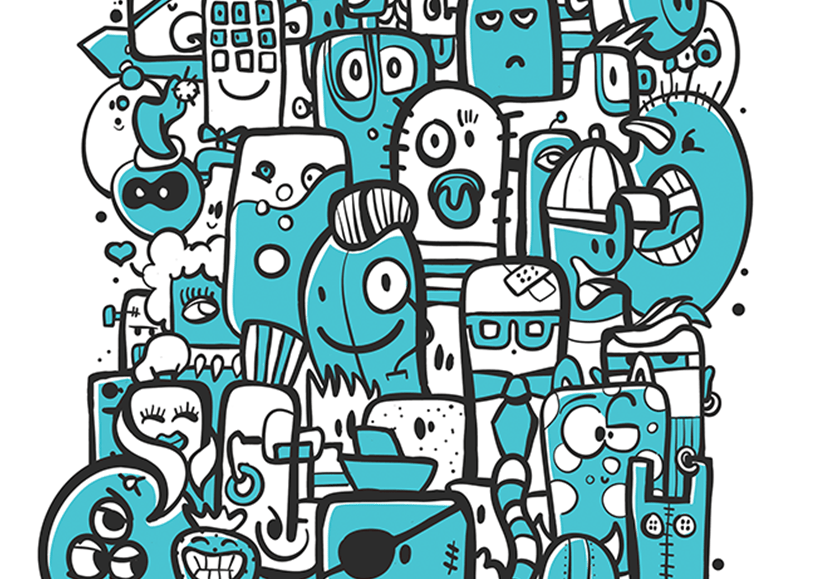
Illustration, on the other hand, was a very useful. After all, it is completely customisable. There are in fact very few restrictions and no privacy sensitivity. Moreover, colourful illustration suited the young target group and unique individuals. Children naturally "get" illustration just fine.
Multiple Styles
The style of illustrations can differ and even several styles can be used simultaneously next to each other. Illustration shows the versatility and unique personalities of students.
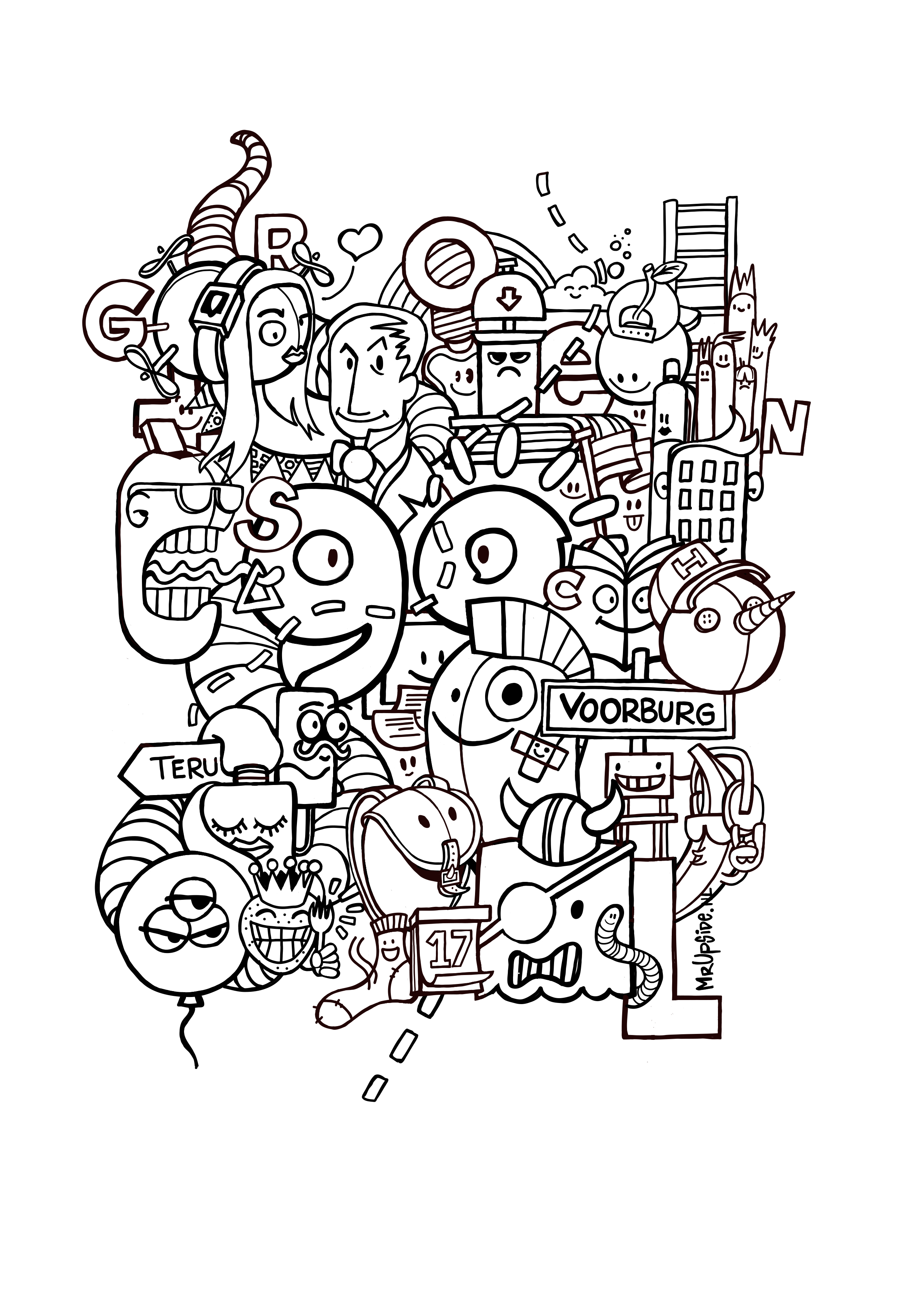
Doodle from own archive
Previously I made 'doodle' style illustrations, as a personal project [link]. The 'doodle' style was well suited to a primary school and the lustrum, because nice and busy and a lot is happening, just like at a school. Such a doodle illustration contains all kinds of unique characters who, regardless of the time in which they belong, work together. A 'doodle' illustration is ideal for colouring pages and the characters can also come back separately from each other in the communication to make it a little less serious. The style appeals to both young and older children at the same time.

Graphical elements
A brand is not just a logo. It is the combination of graphic elements, such as specific colours, typography, shapes and images that ensures recognition. Sometimes even the logo becomes almost redundant. Nike and Apple are examples of this. The logo often plays a subordinate role in their visual communication.
Visual metaphor for the 90-year journey
We were able to reuse elements from the logo in the visual style of the Groen van Prinstererschool. A lot turned out to be possible. This allowed the 'exclamation marks' to form a dotted line, as a visual metaphor for the 90-year journey the school has made so far.
Window
The logo could be used as a 'window', through which photography or illustrations are displayed. The '0' from the logo could be superimposed as a repeating pattern or serve as an infographic. And the logo itself could be used as a fun graphic addition to photography.
Step 6 - Design of communication means
Consistent style
The design of communication tools is highly dependent on the technical pressure capabilities. For example, the printing of a tote bag is often the cheapest in one color. Even then, the style must remain intact.
Examples
That's why Mr. Upside always includes various examples of the use of the new brand identity in its design projects. It is a good test of whether the designs hold up on all kinds of means. And the customer suddenly sees the design come to life and can form a much better picture of the final end result.

Related projects

Groen van Prinstererschool Graphic Design Invitation Relocation Party
To celebrate the completed relocation and renovation, a big party was given. For which a printed invitation had to be sent to all involved. I was asked to pick up the.…
Doodle style illustration ‘Bunch of Weirdos’ - Personal work
“Bunch of Weirdos” is an “doodle” style illustration. Personal work. With ‘doodling’, cartoon characters are apparently randomly drawn without a preconceived…

Circus Themed Illustration Invitation for Liam's First Birthday
Designing the invitation to a birthday doesn't have to be a thing at all. But with two kids and a dad as a Freelance Graphic Designer it does become a thing. And because…