Mr. Upside x Salure
Salure has been an independent partner in payroll administration, financial consultancy and business intelligence since 2010. From their office in Gouda, the Netherlands, they help Dutch and international clients with their financial administration and IT services.


In July 2022, Salure existed 12.5 years. To celebrate this appropriately, together with business relations, a large theater was rented, for about 500 people. In June 2021, Salure approached me via email asking if I could help with the design of a logo and visual design for the event style.
Need
Salure needed an attractive and recognisable visual style for the event. The style should fit within the Salure brand identity. The project could be considered successful if a uniform visual style could be found in all communication surrounding the event.
Challenge
The main creative challenge lay in the rational nature of Salure's services. Financial or IT services are not immediately festive. But at the same time, these services are very important for Salure's customers. They greatly value the reliability, stability and innovation in Salure's financial services and IT services.
Creative strategy
The goal was to create attractive and recognisable communication around an event to which important customers, employees and suppliers of Salure are invited. Salure should be able to proudly present itself to its customers.
-
What is the current situation?
The research focused in particular on the questions: 'What relevant information is already available at the moment' and 'Who is Salure?' and 'What makes Salure special and a reliable partner for its customers?'.What is the future situation?
By defining well in advance what the desired new situation, the actual need, the target group and the goal were, it was possible to better assess during the design process whether the project was moving in the right direction.Overarching theme
It was important that the event had an overarching theme. Such a theme largely determines the visual style of an event. Before the design could be started, a good insight into this theme was required. -
A creative brand identity design must always meet certain conditions. These conditions, or frames, help with an initial selection and assessment of design ideas.
Within the Salure brand style
As mentioned before, the brand identity design for the anniversary had to fit within Salure's brand identity.Celebrate Innovation Together
The theme 'Celebrate Innovation Together' was invented by Salure.'Celebrate' because of the festive nature of a birthday. 'Innovate' because innovation is an important distinguishing element in the Salure brand. And 'Together' because the anniversary would not only be celebrated within Salure, but also together with customers and suppliers.
Innovation
Of the three words incorporated into the name of the event, only 'Innovation' is really distinctive. 'Celebrate' and 'Together' do not adequately describe Salure nor the event.The brand identity design therefore had to radiate 'Innovation'.
-
A pretty picture is far less powerful if it is not based on a substantiated concept. By basing design choices on one central idea, it is much more obvious to the viewer that the applications are part of a larger set. Making the whole set appear more professional and well thought out. An additional advantage for the designer and client is that art direction, design choices and possible creative solutions become much easier to assess.
Three things are important here.
Simple, simple messages communicate far better.
They are remembered better.A creative concept, a visual brand style or a logo design are totally different deliverables.
They serve different goals.
The creative concept of an event is temporary.
Therefor more freedom to move away from the brand identity can be allowed.Unique positioning
The creative concept of Salure’s 12.5 years Anniversary Event had to highlight Salure’s unique positioning in the market. -
Like with the design of a corporate identity, the design of this event consisted of two parts. A logo and a visual style. The visual style would form the largest and therefore most important part of the communication. The logo would just be part of the bigger picture.
The bigger picture first
Thats why I designed this visual style, this larger whole first. First I had to translate the concept of 'innovation' into a visual style. After that, I started the design of the logo. -
As soon as the visual style of the event and the logo were defined, the translation of the design into the various applications was started.
Quite a few applications
This was a valuable event for Salure. They therefore chose to have a relatively large number of different applications designed. Such as beer coasters, Powerpoint and Social media templates, a website, key cords, various posters and a photo wall.


Art Direction and Design
In the research much attention was paid to conversations with Salure, in order to gain insight into Salure's distinctive capacity. Long after the event, this distinctiveness would be the exact thing customers and suppliers remembered and associate with Salure. This distinctiveness turned out to be summarised as 'innovation'.
Event = campaign
Innovation
People are most receptive to single messages. In other words; the simpler the message, the more powerful it becomes. That takes courage, a lot of discipline and hard choices, but ultimately delivers a much more powerful message.
With Salure's 12.5 year anniversary, I determined this simple message as 'innovation'.
Temporality
An advertising campaign is temporary. And always based on one central concept.
In the case of Salure's birthday, the creative concept loses its value as soon as the event has ended. The graphic design of the temporary event 'Celebrate Innovation Together' is separate from the long-term corporate / brand identity of Salure. The campaign is just a temporary addition to the corporate branding.
This temporality often means more freedom to come up with creative ideas for the central concept.
Creative concept: plus symbol
Mathematical characters
The financial world uses its own unique 'language'. It distinguishes the field from other fields. In that 'language', special characters, such as a plus symbol, are used as tools in common activities and services.
Plus symbol
A plus symbol conceptually represents adding something together. But also for something extra, to grow, for something new, for something innovative, for building something. For a positive result below the line.
A 'plus' also stands for the future that Salure is entering. Salure is happy to add years to the collaboration with its customers and suppliers. A plus sign is therefore an excellent symbol for innovation within financial services. And thus a good basis for the design of this anniversary.

Logo design
Recognition, not communication
The creative concept or visual idea is in fact the foundation for all design of the event. The event logo is just one of the applications. A logo does not have to communicate. It must provide recognition. The logo doesn't have to tell a story. Just like cows used to be branded, to become recognisable as the property of a farmer, the purpose of a logo/sign is primarily recognition.
Feeling and emotion
The graphic design elements around the logo, such as color, typography and extra shapes and patterns tell the story. They convey the message, the emotion and a feeling.
Readability
Part of the event name, "12.5," consists of three digit characters (1,2 and 5), separated by a comma. This presented a challenge. The numerals and the comma in the '.5' are difficult to incorporate attractively into a logo. Such a series also needs a high degree of readability in order to communicate well. The name of the theme, 'Celebrate Innovation Together', lends itself much better to processing in a (typographic) logo than the functional '12.5 years of Salure'. Which is the theme, not the name of the event.
Advice
I advised considering using '12.5 years' or something similar, not superior but just next to or equivalent to 'Celebrate Innovation Together'. The theme name can then be used as the main title of the event in the design because of its much higher usability.
Based on the Salure logo
I decided to base the event's '12.5 years of Salure' logo on the Salure logo. In this way the link with Salure is crystal clear.
Folding
Salure has a typographic logo in which the S-shape is the most unique element. In that S-shape, the top, orange part of the S is folded over. That 'fold' has been reused and enlarged in the '12.5 years of Salure' logo for the event. A paper mockup of the letters was made in order to gain a good insight into how this change should take place in the letterforms.
Also a vertical version
For the usability of a logo, it is always good to make a horizontal variant in addition to a vertical one. Online applications (mobile vs desktop) in particular are a good example where both variants come in handy.


Colors
What applies to the entire house style, of course also applies to the logo of the event. By adopting the colours from the Salure house style, a clear visual connection is created between the event and the Salure house style.
Also monochrome
Not every means of communication has the ability to display all desired colours. That is why it is good practice to also design a variant for one color (and black). And a version that is usable on a dark background.
Secondary logo for monochrome use
The challenge with the monochrome and diapositive variant was that gradient shades (such as shadow) could not be reproduced. That's why the letterforms in a minor version have been spaced out in selected places.
Derivative shades
In addition to the primary colors orange and dark blue from the Salure house style, a weakened shade of all secondary colors has also been defined. In addition, a light blue-grey and a warm red-grey have been defined. Finally, two innovative hard signal colors (bright green and bright blue) have been devised.
Typography
Salure's typography is deliberately kept heavy, sturdy and square. This emphasizes the solid foundation that Salure has managed to build over the past 12.5 years. It is also a visual metaphor for the reliability and stability that customers and suppliers find in IT services and innovative software solutions from Salure.
Font: Cornerstone
The Cornerstone font is very suitable for use in the logo. But because it only contains capitals (capital letters) and each letter takes up the same amount of space, it is not always useful for other applications such as running (body) text.
Font: Titillium Web
To counterbalance the heavy solid letters of Cornerstone, the slightly more technical-looking Titillium Web has been selected. It is an extremely readable, versatile font with many different weights and beautiful numbers and special character. Titillium Web is a Google Webfont, which also makes it much easier to use for online applications. This font is ideal for use in headers.
Font: Noto Sans
In addition to the Cornerstone font for use in the logo and the Titillium Web font, a friendly, human and rounder font is needed for, among other things, the larger pieces of text. The Noto Sans font is also a Google font and stands out because of its rounder shapes, which can provide a nice counterbalance to the more technical, tall and angular Titillium Web letterforms. Noto Sans has the advantage that many weights are available, so that texts can be nicely structured. It is also an extremely readable and friendly-looking font.


Additional graphic elements
In addition to typography and color, it is also useful to define some graphic shapes, which are used to supplement the house style with recognisable extra elements.
Plus signs
That's why plus signs play an important role. As a strict and complete grid in the background or as more random “confetti” to bring out the festive character of the event even better.
Innovative lines
The plus signs are inherently static. While 12.5 years of 'innovation', 'together' and 'celebrating' are dynamic core values. That is why dynamic lines have been added as an extra element. Its shape and also the number of lines may vary. Its use is also optional.
Image
By repeating a certain image in the communication, a recognisable visual style is created. Normally, that 'image' can be a static photographic image, illustration, animation or film.
Graphic design elements
But Illustration did not directly match the innovative character of the event. Photography, video or film were also less relevant, only available or desired to a very limited extent. That is why it was decided to give graphic forms a prominent role in the visual style.
Plus Sign
In this case, that meant using a big plus shape. The plus shape was adapted and constructed from two 'folded' parts or four separate parts against each other. Each part can be filled with a photo or a graphic pattern. This created a 'visual device' that could be used in many different ways.
Filling
The filling could be very different per application. For example: per moment in time, so in the run-up to the event a different one than at the event itself. Or a new one every month. Or per application, so a different plus form on the website than on the event itself.
Toolbox of independent parts
All graphic elements (the plus signs, curved lines, the "12.5 years" logo, the "Celebrate Innovation Together" letter logo and the gradient in the background) were designed independently.
In other words: made in such a way that they could be used independently of each other and at the same time depending on the application and the desired message.


Related projects

NWO Synergy 2021 event – Design main illustration and Event Identity Design
NWO Synergy in 2021 was different from other years. Synergy is an annual event of the Dutch Research Council (NWO). In 2021, due to the COVID19 pandemic, it was held completely online…
Westerpop Delft Free Music Festival - 25th anniversary Event Identity Design
Westerpop is a free music festival in Delft, the Netherlands, every two years. In 2009 it celebrated its 20th anniversary as a festival. Mr. Upside was asked to provide the brand identity design and…
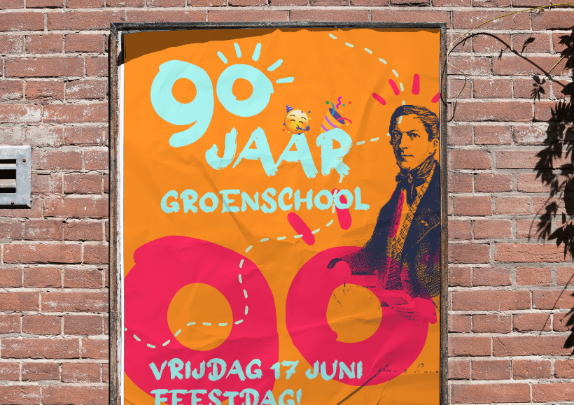
Groen van Prinstererschool 90th Anniversary Year Event Identity Design
In the 2021-2022 school year, the school celebrated its 90th anniversary. In February 2022, Mr. Upside was asked to provide the logo and visual communication for the 90th anniversary...