Mr. Upside x Sports Online BV
Summersport Store is the new sister of Wintersport-store.com. Owner and E-commerce Specialist Dion de Groot asked Mr. Upside to design a brand identity extension in the form of a new logo for Summersport Store.

Client(s)
Services delivered
Brand Identity Design
Art Direction
Communications Consutancy
Dion de Groot is owner of Sports Online B.V. The company manages the webshop Wintersport-store.com which sells, logically, winter clothing and accessories. Dion de Groot and Michiel Nagtegaal (Mr. Upside) know each other from both working at the largest Dutch telecommunications provider KPN.
“Develop a logo like that of Wintersport-Store.com, but for the summer variant; SummersportStore.com”. That, in short, was the briefing Dion gave me when he approached me.
Same but different
Summersport Store sells summer sportswear. It aimed at becoming a 'sister brand' so Dion only wanted to change the name. The letter logo and even the pay-off therefore had to remain the same. The brand mark should, of course, not show a winter sportsman. The 'new' summer athlete would need sunglasses, summer headgear and, again, a beard.
Doesn't sound difficult. And it wasn’t.
But I had a clear and strong opinion about the existing Wintersport Store logo. Saw many possible improvements. “If the foundation, the Wintersport Store logo, is good, the Summersport Store logo will immediately start off better.”, was my reasoning. Dion was open to new proposals.
“Design a logo similar to Wintersport-Store.com, but in a summer version, for SummersportStore.com”
Dion de Groot - Owner Sports Online B.V.
Project approach
Research & discovery
Most Brand Identity Design projects have quite an extensive discovery phase. In which markets and competition are researched. It’s impossible to design a unique brand identity when the context, the world the brand will live in, is unclear. In this case the briefing and project scope was so specific that the research was reduced to almost none.
What's already there?
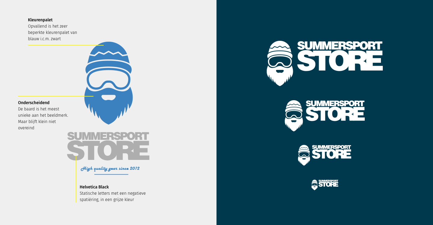
If you take a closer look at the Wintersport Store logo, you will immediately see that the brand mark is the only distinguishing part of the logo. Anyone can put Helvetica Black letters too close together. Not the letter logo but the brand mark therefore became Step 1.
Made up of three parts
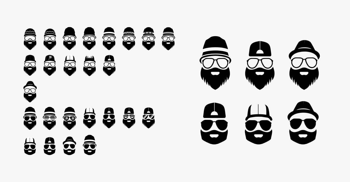
After an even better look at just the brand mark, it became clear that the logo consists of three separate parts. Headgear, glasses and beard. This structure ensures that you can easily replace a part. Without it immediately becoming a completely different logo. Exactly what Dion had in mind.
Strategy Phase
Where are we going?
In order not to run into all kinds of annoying problems when applying the logo in the future, there are also a few technical points of attention.
Future proof, vector based logo
The current logo was probably designed in Photoshop. In any case, it was supplied as a Photoshop document. That's too bad. Adobe Photoshop is made for image editing. Not to design razor-sharp logos. If we wanted a future-proof, vector-based logo that would remain razor-sharp even at the size of an apartment building, tracing in Adobe Illustrator was necessary. When tracing, Adobe Illustrator converts pixels to vectors (mathematical formulas). You don't design logos with pixels. You do in vectors.A good silhouette
A logo should not only do its job on the side of an apartment building. Even in very small formats, it still has to ensure recognition of the brand. Do important details not disappear with small use?
That is why it is important to look closely at the silhouette of the logo. The logo must also work in reverse (white logo on a black background). Brains see a dark logo on a white background differently than white logo on a dark background. And if all the colors disappear? Will the logo still be recognizable? That's why it's crucial to design the logo in black only at first.
Summer beard?
A hat is something for the winter. There had to be a more summery headgear. You also usually do not wear winter sports glasses on the beach. So summer glasses were also necessary.
And then the beard. The full beard is not a problem in the snow, but a lot less pleasant in a summer, warm setting. However, a good shave was out of the question. The beard had to stay. A critical grooming session did not seem a problem to me, however. It would provide a summery look & feel.


Art Direction and design
Sports and summer
A logo visualises the essence of a brand. It illustrates and identifies. Summersport Store is 'Sporty in the summer'. Although that is actually a bit too functional for a brand essence. "Sport" and "summer" are in any case two important core values.
But I had a clear opinion about the existing Wintersport Store logo. Saw many possible improvements. “If the basis, the Wintersport Store logo, is good, the Summersport Store logo will immediately become better.”, was my reasoning. Dion was not difficult and was open to new proposals.
Laid back beard
Good art direction works with associations and reinforces unique elements. You don't directly associate a full, laid-back beard with sports. The image of a full beard is therefore not very suitable. If there must be facial hair at all, then a trimmed version.


Sportier sunglasses
With 'sports' in mind, the goggles I previously selected and worked out were more of a pair of goggles suited to a 'hammock session'. Not with a sporty and active lifestyle that Summersport Store supports with its products. That is why there had to be even sportier sunglasses.
Rebellious headgear
What kind of headgear does a summer athlete use? A baseball cap? You can wear a baseball cap in several ways. The Wintersport Store logo already created a slightly more rebellious look with beard and hat. To match Summersport Store with its winter variant, a rebellious look was needed here too. The cap therefore had to be worn backwards.
Color
Summer = sun
A webshop that sells summer sports equipment calls for summery, sunny colors. In addition, the consistent use of one dominant color makes the Summersport Store brand more recognizable. Think of T-Mobile's magenta, Shell's yellow and Coolblue's blue.
Blue water
When looking at summery, sunny and sporty photos, you will notice that many activities have to do with water. Water is blue, but selecting blue if the sister brand Wintersport Store has already 'claimed' blue is not convenient.
Orange
Therefore, a warm shade of orange is a better choice. Summer weather is filled with the sun. Orange is a sunny color. And an active color. Suitable for sporting activities. The suggested color orange is tough enough not to get too feminine. Dark enough to have sufficient contrast on a light background and bright enough to provide the desired active, sporty look.


Typography
Typographical hierarchy
It is special that a webshop that sells sporty products uses a very static, inactive-looking font. The letters should be imbued with 'sport'. Sports are dynamic. The current letters create a more static appearance of concrete, more appropriate for a bank building with a safe. By slanting the letters, there seems to be more movement, more dynamics. And “exercise” is exactly what sport is.
Furthermore, in the current logo, the typographic hierarchy is not in order. 'Store' is much bigger. And therefore seems more important than the distinguishing element; 'Summer sports'. As a result, something generic like 'Shop' gets much more attention than the type of store. The solution lies in a different typographic hierarchy.
Pay off
The Wintersport Store payoff, 'High quality gear since 2012,' is a common example of emphasizing the basics. Almost every company sells 'high quality'. No company will proudly say that they sell 'Low quality' stuff. Quality is a precondition for being able to participate in the market at all. 'Quality' is not distinctive. Neither does gear. "Stuff" is so common that it doesn't make anyone hot or cold. And not from 'since 2012' either.
What should it be?
Many companies lack distinctiveness. Line them up with five competitors and they will all tell you they are the best. Why should customers buy their products from your company, and not from the competition?
“We are the only ones who…”
By positioning yourself as “the only one who…”, it takes much less effort to stand out from the crowd. You can use the unique brand essence that comes from a brand strategy for a good pay-off. Preferably with emotion in it, so that the communication also strikes an emotional chord with the customer.


Execution Phase
Execution of the strategy
I started by tracing the existing Photoshop logo. This resulted in a 'clean' vector file as a solid basis for new adjustments.
Negative and positive space
First, an example of summer glasses was sought. Those glasses were recreated in Adobe Illustrator. And the choice was made to fill the glasses black. This resulted in a better balance between the negative and positive space in the logo. Fewer thin lines and less detail.
Six proposals
After that, the winter hat in the logo was replaced by a summery 'fisherman's hat', a baseball cap and an alternative 'straw hat'. From a number of sketches, I then selected six suitable proposals myself. Three logos with the traditional full beard. Three with a sportier beard. Three of them with glasses with 'open' lenses, three with dark glasses. One proposal with some horizontal lines in the glasses, to obtain an extra summery, somewhat retro look.
Presentation Round 1
Focus on the concept. And the beard.
In my extensive explanation and substantiation, I recommended a sportier beard. I left the letter logo undisturbed for the time being. Dion selected the fisherman's hat, the dark glasses with horizontal 'retro' lines and an unchanged beard. He especially wanted to retain the 'laid back' feeling of Wintersport Store and include it in the Summersport Store logo.
Presentation: Round 2
Focus on typography
In Round 2 I focused more on the typography. I didn't want to deviate too much from the current typography, so as not to make the switch to a new logo too big for the existing customer base.
Helvetica Black, but modified
I kept Helvetica Black as the font. But now I used the 'Italic' variant. The oblique letters look more dynamic and therefore sportier. I also reduced the negative spacing from -150 to -80, to increase readability and literally give letters more 'air'.
Attention is stolen
In addition, I wanted to reduce the dominance of the unimportant 'store'. And emphasize the distinctive 'Summersport'. With an equal font size of the two words, this would automatically happen, because 'Summersport' contains more than twice as many letter characters than 'store'. The bigger word "steals" the attention of the smaller word automatically.


Visual clustering
It also presented an additional challenge. Namely a major visual imbalance between the two parts. That was solved by cutting 'Summersport' into two parts. This resulted in three almost identical words. All three starting with an 's'. 'Summersportstore' is grammatically not one word. And I wanted the viewer to read 'Summersport' first and then 'Store'. The top two words therefore had to be visually clustered.
That's why I turned it around.
Recognizable family
By giving 'Store' a dark background and white letters, a logo was immediately created within a logo. This offers the possibility of identifying new, future stores in the same family in this way.
Slanted lines continued
I also advised emphasising the oblique lines in the typography of the letter logo. Because it lacked unity, with an upright logo and slanting letters next to each other. The left and right halves of the logo are identical. You can therefore choose to 'sacrifice' one half in order to arrive at a more unique logo. In which even the sporty oblique lines are reflected.
Using the logo in this way can be conceptually well substantiated because 'behind everything' that is sold on the web shop, there is always the man with the beard. Literally and figuratively.
Accent color in logo
Dion wanted a fuller, more pure orange than was advised in Round 1. The logo actually consists of three parts; a hat, glasses and beard. Since the orange was supposed to be the only color in the logo, it automatically takes on the role of accent color.
Letter logo
In the letter logo, either 'Summersport' or 'Store' had to be orange. I advised putting 'Summersport' in black. By giving the logo its own color, it stands out more and the whole becomes more recognizable. In order not to get large colored clusters, 'Store' also became a color carrier. Where the color of 'Store' could be different at every webshop.
Presentation: Round 3
Research
The third and final round of proposals was reserved for research into the correct dimensions and proportions between the different graphic elements in the logo design.
Visual Balance
One way to achieve visual balance in a logo is to use the repeating distances and sizes. After all, brains automatically and unconsciously search for (visual) connections in order to understand things. By making visual connections, a logo is created that is 'understood' faster and above all more attractive.
Related projects

FelixFlos.nl socks webshop UX/UI Design
FelixFlos.nl sells self-produced more luxurious socks in the higher market segment. In 2018, Ritu Ramlal, together with his partner and co-owner Hedy Bootsma…

O’Neill.com international webshop UX-UI re-design
O'Neill's international webshop needed a redesign. I was approached as a Freelance UX/UI Designer, improving the e-commerce activities of the iconic surf and snowboard brand.

25th anniversary Westerpop Music Festival Delft Brand Identity Design
When Westerpop celebrated its 20th anniversary as a festival, Mr. Upside was asked to provide the brand identity design and visual communication.