Mr. Upside x Dammie
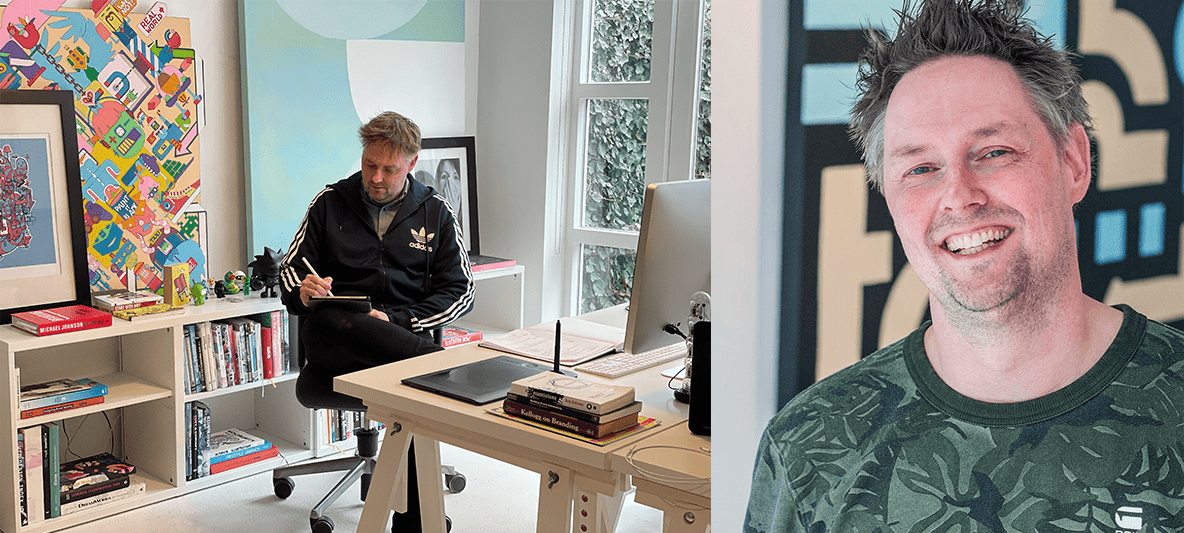
Dammie van't Zelfde has over 10 years of experience as a creative Copywriter, Search Engine Optimisation (SEO) and Facebook Advertising Specialist. In 2019 he decided to start his own company with these services. He approached Mr. Upside for a creative twist on his brand identity.

Client(s)
Services delivered
Brand Identity Design
Visual Communication Design
Art Direction
Communications Consultancy
How do you summarise three different, relatively abstract, services (Copywriting, SEO and Social Advertising) in one brand identity? Dammie also didn't have a clear picture of what the visual communication of his brand new company should look like.
Word artist
A word artist with a sense of language
Dammie is a true word artist. And he has the obvious, excellent sense of language that comes with a copywriter. He was once the creator of the legendary slogan of the Dutch candy brand Redband; "Redband, als je voor pret bent!" Which is still in use by Redband.
KPN
In 2019 Dammie decided to leave his day job and persue entrepreneurship with freelancing as a Social Advertising Specialist. Dammie en Mr. Upside know each other well from their time at one the largest telecommunications providers in the Netherlands, KPN.

Project approach
Research & discovery
First of all, various intensive and in-depth discussions were held. A number of unique and personal character traits quickly emerged from those conversations. Dammie is a solo entrepreneur. That is why we chose to emphasise a number of personal characteristics in the logo design and Dammie’s corporate identity.

Creative Strategy
After the first initial conversations, meetings and research, a proven and more classic path of approaching this Brand Identity Design was chosen. Because of ‘Dammie’ being a creative one man show, the personal view of the owner, Dammie van ‘t Zelfde, was used as the conceptual foundation for his brand.
Steps
Start by investigating who Dammie really is.
Investigate what his competition does. How do they communicatie their services?
Then investigate what Dammie likes in terms of graphic design.
Summarise the brand (Dammie himself) in a few keywords.
Translate those keywords, his preferences in graphic design and his services and target group to a visual language.
Once we have the logo and brand style, translate this brand style into some of the required (digital) products and collateral.
Concept, Art Direction and Design
Positive attitude
People around Dammie characterise him as funny and full of humour. That positive attitude, Dammie's humour and even healthy self-mockery had to be reflected in the logo. With a twist. Less well-behaved and especially not too serious or too businesslike.
Colorful Pinterest board
Mr. Upside had asked Dammie to make a Pinterest board with all kinds of graphic design that really spoke to him. From the Pinterest board, which Dammie, on the advice of Mr. Upside for this project, it immediately became clear that Dammie had to become a colorful brand. A brand that likes to draw attention.
Graffiti is branding
Combined with language, the core value of 'colourful' in the creative strategy touched on the concept of 'graffiti'. Graffiti is about seeking and finding attention. Just like SEO. Graffiti is actually advertising of brands. It's about being found with (hash) tags. With language. And brands are actually being built within the graffiti scene.
Trend sensitive
Dammie is at the heart of society and has a good sense of trends. He is also headstrong and stubborn in a positive way. That somewhat rebellious attitude was translated into a stubborn appearance. Especially the additional elements from the house style can play an important role here. By aligning the logo to the right as much as possible, the somewhat rebellious and contrarian appearance is communicated.
Three key concepts
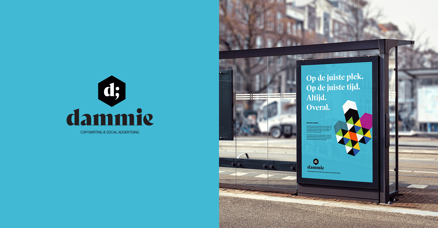
In the end, we visually combined three key concepts from the Dammie brand in one symbol:
Dammie's output, his daily deliveries, are typographical characters. They are his tool to get his messages across. This production of characters is conceptually represented by a typewriter. And visually represented by the classic typewriter letter 'Courier'. The classic character is a reference to Dammie's years of experience as a copywriter.
Dammie believes in Social Media and uses the relatively new medium like no other. A reference to Social was therefore obvious. This was visually translated by a "wink" emoji that sticks out his tongue. A literal wink to the business and the brand itself. Not too serious and with a healthy amount of self-mockery.
An important part of Dammie's services is search engine optimization (SEO). This is visually represented by a magnifying glass.


Execution and further development
Still under construction
Although the logo and color scheme have been developed, all other corporate identity elements such as printing and website are still under development. However, a set of Social Media images has been delivered that Dammie already uses.


Related projects

‘Bunch of Weirdos’ illustration - Personal work
“Bunch of Weirdos” is a “doodle” style illustration. Personal work. With ‘doodling’, cartoon characters are apparently randomly drawn without a preconceived…

Duo Penotti Hazelnut Spread UX/UI Design marketing website
Duo Penotti as a brand and product was conceived in the early 1970s by Marcel Peeters. The recipe for this delicious hazelnut spread is based on his grand…

Supershift Full-service Web Agency Brand Identity Design
Full-service internet agency Supershift 'shifts' your company into a higher gear! In 2000, during the rise of the internet, Marc Molenwijk and I the agency.