Mr. Upside x NIBC Bank
On November 29, 2018, NIBC had a Capital Markets Day organised at The Curtain Hotel in London. However, it still missed a logo and invitation for this day. Mr. Upside was asked to design the corporate identity and visual communication for the event.

Client(s)
Services delivered
Event Identity Design
Visual Communication Design
Art Direction
Communications Consultancy
From 2015 to 2020 Mr. Upside was commissioned by the Dutch investment bank NIBC for the Art Direction and Graphic Design of internal and external communication. Invitations to events, management dinners and brochures. The annual Christmas card. But also the menu for the company restaurant in the head office in The Hague. So a lot of traditional printing. But in recent years, digital communication became more common.
NIBC Capital Markets Day
For financial stakeholders
For a company like NIBC it is important to have regular contact with stakeholders. Many companies organise Capital Markets Days. Often out of season. They give financial stakeholders the opportunity to meet with company management, learn more about the company in general and usually a division in particular. Or giving an update on the corporate strategy.
A capital market day is usually announced in advance. Many larger companies hold an annual Capital Market Day and broadcast it through their website. It is customary to place the (slides of the) presentations on the website.
Visual communication design
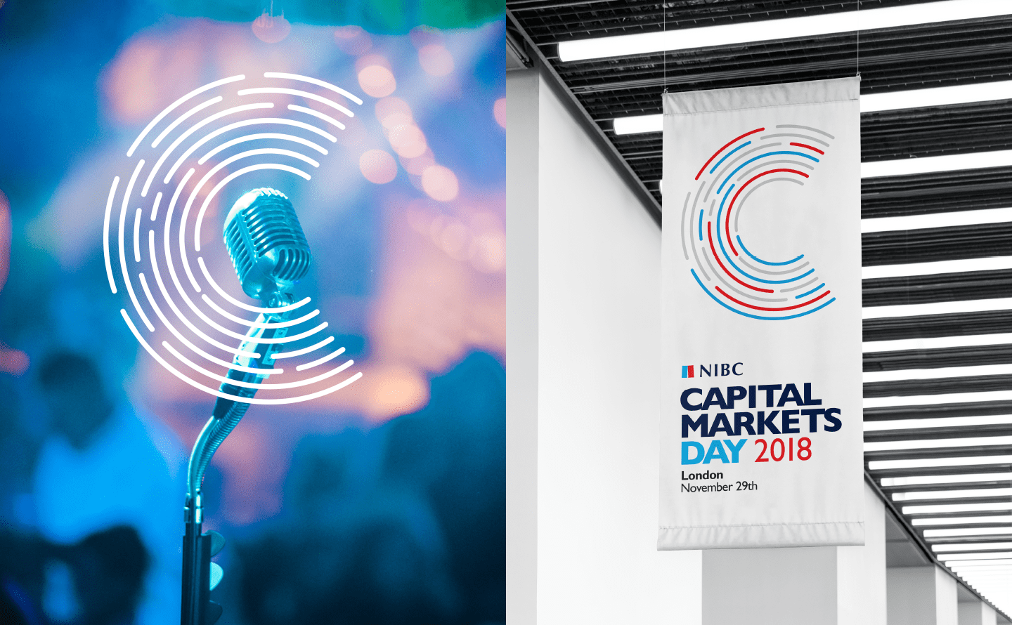
In 2018, NIBC had a Capital Markets Day organised at The Curtain Hotel in London. However. The event needed a logo and invitation for this day. NIBC reached out to Mr. Upside for the visual communication design.

Project approach
Research & discovery
From the extensive documentation provided by NIBC about, among other things, previous Market Capital Days and more extensive research into how other (financial) institutions organize a similar event, it became clear that such an event is a way to provide an annual status update. So a lot of data and business strategy.
NIBC corporate identity as a foundation
With NIBC owning the event, the logo had to be designed with the NIBC corporate and brand identity in mind. Of course there was room for a new logo. But the colours blue and red, and the Gill Sans font, where mandatory.

Creative Strategy
Logo in NIBC look&feel
The creative strategy was simple.
By basing the visual communication of the event on the NIBC corporate brand identity, it immediately became clear to visitors and those interested in the event, that NIBC Bank was the owner of the event. It instantly added a certain reliability to the communication surrounding the event.
First of all, there had to be a logo, a symbol. Colours and typography were already fixed.
A lot of information
Since the name of the event is rather long, the logo quickly becomes quite busy. A lot of information has to be stated within a limited space. That is why Mr. Upside opted for a symbol that is as independent as possible.
Insight 1: the logo had to be able to be used, more than average, in a way that is separate from a legible letter logo.
Temporary
In addition, it had to be made clear that the subject of the event was time-bound (or temporary). Namely financial data and corporate strategy of 2018.
Insight 2: some emphasis on 2018 was desirable.
Creative concept, Art Direction and Design
Metaphors for financial communication
A bar chart, like a Capital Markets Day, shows the movement of 'information' over a certain 'period'. A bar chart is also often used in a financial presentation. A bar chart, in the two main NIBC house style colors, therefore became the basis for the house style of the financial event.
C-shape to bring attention to the center
When a drop falls into a pond, waves are created. From the center and in a round shape. These water waves are a well-known visual metaphor for communication. After all, messages and communication also spread like waves. Large groups of people traditionally also come together in a circle. Think of amphitheatres, parliaments and conference rooms. They use a C or circle shape to draw attention to the center.
Also, a solid C-shape has a visual resemblance to a magnet, and thus to attraction. The bar chart was therefore bent into a C-shape. And the C-shape in this context became more than just the 'C' of 'Capital'.
It became a metaphor for communication.


Execution and further development
Solid typography
Such a Capital Markets Day is a large and important event. Not something that light letters go with. That is why a strong and bold version of the Gill Sans house style font was chosen as the main font.
In addition, 'Capital Markets Day 2018' is an awkward long word to use as a letter logo. That is why the choice was made to break up the four words over three lines.
Where desired, the NIBC logo and the date and location could be omitted.
Internal communications
Various digital invitations have been designed to invite people within NIBC Bank to the event.

Related projects

Jonkheer Sound & Light rental Brand Identity Design
Light and sound rental company Jonkheer Sound & Light Support provides dance events and large music festivals with professional light and sound equipment, AV…

NWO (Dutch Research Council) Synergy event Brand Identity Design
NWO event Synergy is an annual event organised by the NWO domain Social Sciences and Humanities (SSH). Freelance Event Manager Kim van den Wijngaard of…

25th anniversary Westerpop Music Festival Delft Brand Identity Design
Westerpop is a free music festival in Delft, the Netherlands, every two years. In 2009 it celebrated its 20th anniversary as a festival. Mr. Upside was asked to…