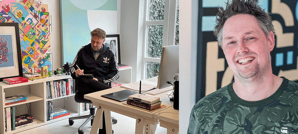
Mr. Upside x Kimspiratie / Kim van den Wijngaard
Kimspiratie Communication & Events is the company of Kim van den Wijngaard, a Freelance Communication Consultant and Event Manager. After previously working together on images for the NWO event Synergy 2020, Kim approached Mr. Upside for a re-design of her own corporate identity.

Client(s)
Services delivered
Brand Identity Design
Art Direction
Communications Consultancy
Kim is a connector, consultant, Project and Event Manager and concept developer. New assignments mainly come in through word-of-mouth advertising and her network.
Word of mouth
Kim can be found online via the various Social Media channels. And her own website, which clearly needed to be renewed. It wasn’t responsive, among other things. Kim started her business around 2015 but for practical reasons she never had her corporate identity professionally done by a designer.


Project approach
Research & discovery
The research phase in this project was relatively limited because Mr. Upside and Kim van den Wijngaard already knew each other fairly well. Also through an earlier project for the Netherlands Organisation for Scientific Research (NWO).
Cosmetic update
Several conversations and a short exploration of Kim’s competitors provided the necessary input for this project. The conversations revealed that Kim mainly needed a cosmetic update to her visual identity.
The way she did business and landed customers (through word of mouth) wasn't going to change. Kim’s existing brand and brand expressions simply no longer reflected the current professionalism and distinctive character.
Kim's distinctiveness
Kim distinguishes itself from the competition by a strong focus on content. Many of the events in which Kim is involved are initiated and organised by the Dutch cultural sector and (semi) government institutions.
Kim is able to delve into the, often complex, subjects that these institutions work with. Her strong focus on the subject involved, makes it possible for Kim to provide consultation in a unique way. To shape the communication based on and derived from the content.


Creative Strategy
No content without frames
Visually representing an abstract concept such as “content” is a difficult challenge. Even more if you also want to establish an emotional connection with the target group.
The contrast between content and communication is challenging but also extremely interesting.
Insight 1: Content is always directed inwards. Communication is directed outwards.
Insight 2: There is no content without frames.
Content is defined by a framework
Content is defined by a framework, by its frames. Displaying content without frames is impossible. This can be used as a visual metaphor for communication and the presentation of topics an event is presenting. The “k” of Kimspiratie controls the communication from the core, from the content.
Art direction
To the point
Kim comes across as a down to earth person, averse to drama. She is to-the-point, organised and very experienced. Kim is a woman, a bon vivant, an approacher and reliable. With both feet on the ground, versatile and pragmatic. In other words, Dutch :)
Kim is Kimspiratie.
Reflecting personality treats and core values
Because the logo represents a solo entrepreneur, the logo should clearly reflect these personality traits and core values. Sober, without too many antics. Feminine and powerful. Drama, too much details and curly lines should be avoided.
Striking, opposite colours can represent the apparent contradiction between content and communication.


Execution and further development
User Experience (UX) and User Interface (UI) Design
The corporate identity that was developed also had to have a strong digital component, since much communication from Kimspiratie takes place via online means such as Social Media. Mr. Upside translated the shapes and colors from the logo into appropriate online typography.
The UX (wireframes + clickable prototype) and the UI (user interface) of the website were also designed. The design was modified in a number of rounds in collaboration with Kimspiratie and after approval quickly built in Wordpress with the help of Visual Builder Elementor.
One page Wordpress website
One page proved more than sufficient to display all crucial information. In an earlier prototype Kim’s full portfolio was presented on a Case Overview page leading to a Case Detail Page. But there was little need for a complex website in the past and it was expected that this would not be the case in the near future.
Would there be a need for a more extensive, multi-page website in the future, the website could easily be expanded with multiple pages.
Translated into digital means
A beautiful corporate identity has been designed. With a creative concept that reflects the services of Kimspiratie in an appropriate way. Subsequently, the corporate identity was successfully translated into a portfolio website that shows the past projects well.
Mr. Upside also took care of the technical part, building the portfolio in Wordpress. Currently various collateral and a set of illustrations is designed that will extend and enforce the Kimspiratie brand identity.

Related projects

Jonkheer Sound & Light Rental Brand Identity Design
Light and sound rental company Jonkheer Sound & Light Support provides dance events and large music festivals with professional light and sound equipment, AV systems…

NWO (Dutch Research Council) Synergy Event Brand Identity Design
NWO event Synergy is an annual event organised by the Dutch Research Council (NWO). Freelance Event Manager Kim van den Wijngaard of Kimspiratie approached Mr…

Mobiele Bierproeverij (Rolling Beer Tasting) Brand Identity Design
Mobile beer tasting? Think of a bar. Think of a big trailer. And think of beer. Combine those three and you get ‘de Mobiele Bierproeverij’ (the Mobile Beer Tasting). And…