Mr. Upside x Jump
Jump is a software builder based in Zwijndrecht, the Netherlands. It helps organisations grow through innovation and the digitization of processes. Software applications such as apps and web applications are customized for a broad spectrum of clients. Jump, with its close-knit and committed team, has proven to be a player that can deliver innovation projects successfully. They do this with an approach in which small iterations are used to build towards a successful end result.


Client
Services delivered
Brand Strategy
Brand Identity Design
Webdesign
Art Direction
Communications Consultancy
Graphic Design
Project Management
Quick links
Challenge
No more start-up
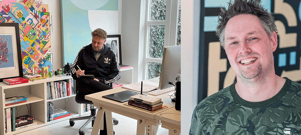
Jump has now been around for more than five years. In those years, it has grown rapidly. Not only in staff numbers but also in working methods and professionalism. Although they have worn the label 'start-up' with due pride, it no longer applies. Jump's identity is no longer the same as when Jan-Maarten, Marc and Peter started.
Two apparent contradictions
The visual identity fitted at launch also proved to be no longer appropriate. A new look&feel was badly needed. One that suited the mature player that Jump has become.
A major challenge was to bring together two apparent contradictions. On the one hand, Jump stands for solid reliability. Which comes from the high calibre of its employees and its desire to attract even more larger companies and governments.
At the same time, Jump was keen to retain its original start-up vibe; creative, young and headstrong when it comes to its fast, pragmatic approach to projects.
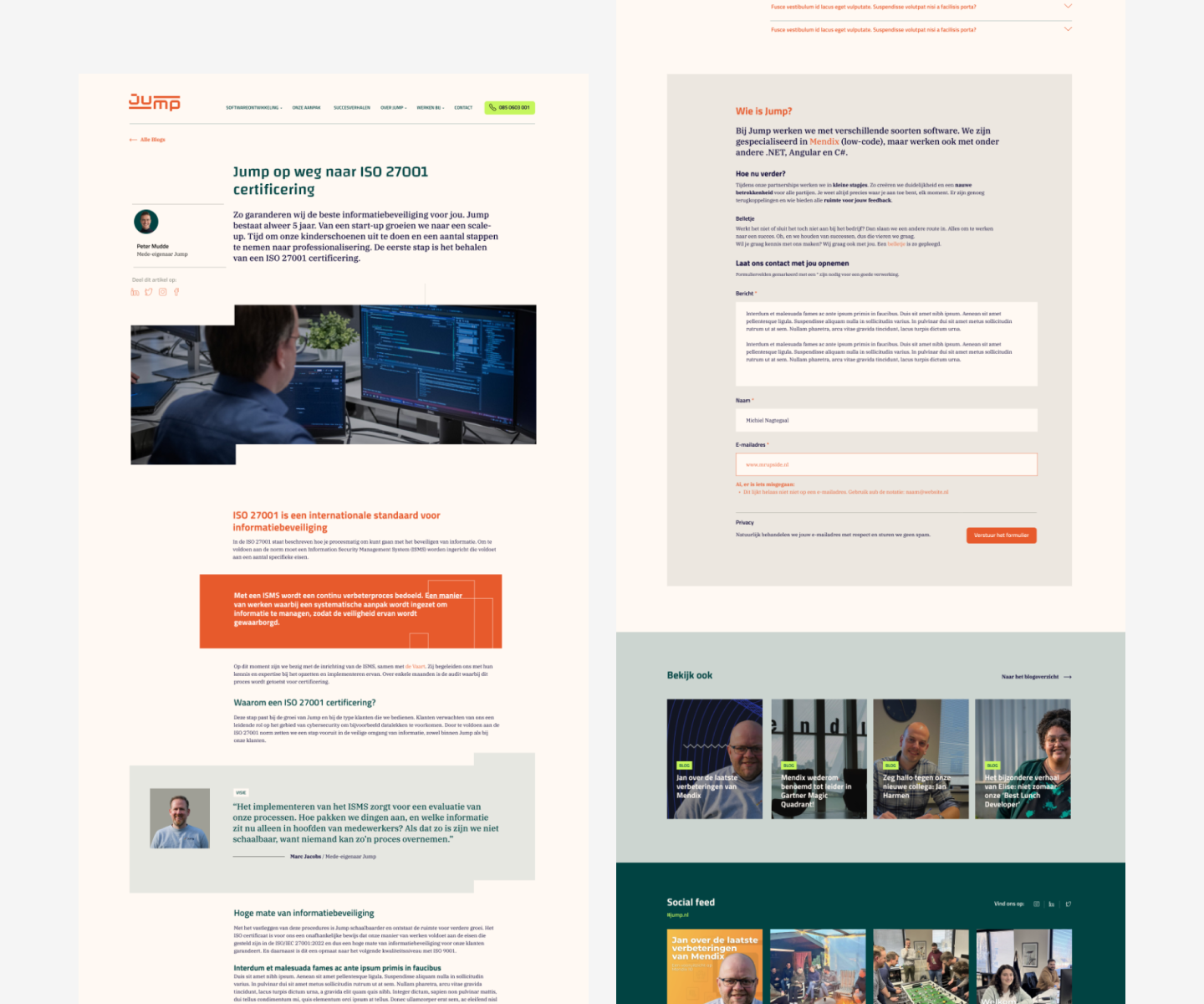
Corporate identity applications
The new look&feel had to be reflected in the website and in various applications of the corporate identity. In addition, Jump sees, from the start, the value of good staff, of Employer Branding. So that the ambitious growth will not be slowed down in the coming years, if at all.


Approach
Working closely with Jump, in total five Brand Strategy sessions were held using the Mr. Upside Brand Model to find out where Jump’s strengths and distinctiveness lie. The defined core values were translated into a visual corporate identity that is unique in the software market.
11 steps
In fact, the proven and tested Mr. Upside approach (11 steps) was used:
Brand Strategy Interviews (5)
Brand Passport
Design Stylescapes with Art Direction for the corporate identity.
Logo sketches
Logo Design
Colors
Typography
Design additional graphical elements
Imagery concept
Design of corporate identity applications
Design Brand Book
For Jump I used a slightly altered workflow.


Result
Visual concept
Breaking the status quo, facilitating growth and 'raising the proverbial bar' were visual concepts reflected in Jump's new visual brand. Along with a pixel, because many people still visually associate digitisation, code and software with pixels.
Of course, we wanted to stay away from visually representing a jump. That would be far too obvious and do less justice to the high level of service Jump provides.

Pleasant tension
Keeping the visual communication of all assets around the logo clean, mature and businesslike, with plenty of white space providing calm, but at the same time making the logo creative, young and rebellious, created a nice tension throughout the corporate identity.
Big and reliably 'heavy' at the base, with secondary airy details make the corporate identity reflect exactly Jump's identity and what Jump needs for its important next leap.
Colour and typography
Orange
Jump had already made a conscious choice for orange in its existing corporate identity. And it still fits. Orange is softer than attention-grabbing, halting red and creative yellow. Orange inspires and creates enthusiasm, and suggests a sense of fun, optimism and adventure.
Distinctive in the market
In a sea of blue logos in Dutch business services, and software companies in particular, the colour orange is not a bad choice. It stands out and also fits the startup vibe that Jump would like to maintain.
Fitting with core values
For Jump, the core values of 'respect', 'responsible', 'value', 'growth', 'personal' and 'positivity' were previously defined. Where orange fits well with positivity.
To the core values 'responsible', and 'respect' belong solid and more dark colours. A dark colour also matches well with cheerful, adventurous and positive orange. Like a financial bank. Reliable but not boring blue. 'Value', certainly translated as 'premium' and 'quality', can also be translated into a darker, often green, colour.


Related projects

NWO Synergy 2021 event – Design main illustration and Event Identity Design
NWO Synergy in 2021 was different from other years. Synergy is an annual event of the Dutch Research Council (NWO). In 2021, due to the COVID19 pandemic, it was held completely online…
Westerpop Delft Free Music Festival - 25th anniversary Event Identity Design
Westerpop is a free music festival in Delft, the Netherlands, every two years. In 2009 it celebrated its 20th anniversary as a festival. Mr. Upside was asked to provide the brand identity design and…
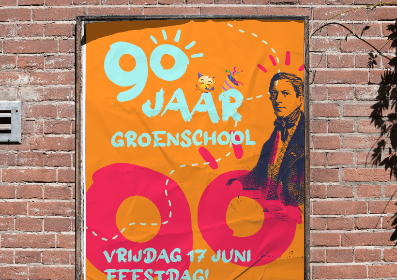
Groen van Prinstererschool 90th Anniversary Year Event Identity Design
In the 2021-2022 school year, the school celebrated its 90th anniversary. In February 2022, Mr. Upside was asked to provide the logo and visual communication for the 90th anniversary...