Mr. Upside x Oranjestad Physiotherapy
In 2021, Peter and Rob left their practice De Lage Korn, in Buren, The Netherlands to start their own, new practice, Physiotherapy Oranjestad. And approached me, as a Freelance Brand Identity Designer, for their new corporate identity.


Client
Services delivered
Brand Strategy
Brand Identity Design
Webdesign
Art Direction
Communications Consultancy
Project Management
Quick links
Early March 2021, Peter send an email to Mr. upside. In which he indicated that he was starting a new practice, called Physiotherapy Oranjestad, together with Rob van der Werff. And he asked whether Mr. Upside would be able to help designing their new Brand Identity and website.
Oranjestad Buren
The town of Buren in Gelderland, where the practice is located, is allowed to call itself Oranjestad, because of the connection with the Dutch royal family. Willem van Oranje married Anna van Buren in 1551. Dutch Queen Maxima and King Willem-Alexander are therefore Countess and Count of Buren.
Need
The new physiotherapy practice did not yet had a visual style. The practice left by Peter and Rob, Physiotherapy De Lage Korn, continued to exist, so it was not possible to transfer this ‘old’ Brand Identity to the new practice.

Challenges
There were three challenges in this creative process:
The main creative challenge was coming up with a corporate identity that doesn't use the visual cliches used by the majority of physiotherapy practices. For example, research learned that images of backbones are often used in the logos of competitors. We had to look for distinctiveness, obviously. Not more of the same.
The second challenge was more related to marketing. There are relatively many physiotherapists in the Netherlands. Patients do not want to travel long for just an hour of treatment. This means the market is very local. Customers generally know where to find the local physiotherapist. So the majority of ‘promotion’ goes through local, inter-personal social networks.
New business literally walks into the practice. Or people are referred to the practice by their General Practitioner. If customers come naturally, and there is no ambition to start a huge company, there is no need to design a very high-profile corporate identity. Simply good was good enough in this case.
Creative Strategy
“There is no strategy without a goal. If you don’t know where you are going, it’s impossible to define the steps to get there.”
The Goal
The goal for this project was fairly straightforward:
”Develop a visually appealing corporate identity for a locally operating physiotherapy practice. And convert that corporate identity into a suitable website. So that Oranjestad Physiotherapy acquires a unique visual identity, digitally and offline, that is very recognisable. And gives a professional and reliable appearance to the practice.”
Six steps
I used six steps in this project to reach that goal:
Step 1 - Research
Step 2 - Brand Strategy Sessions
Step 3 - Creative conditions
Step 4 - Creative concept
Step 5 - Corporate Identity Design
Step 6 - Design of applications


Step 1 - Research
Current situation
The communication of the existing practice was looked at, and especially the way in which communication was currently taking place. Physiotherapists in general were also examined. Useful, because I was hardly acquainted with this world.
Future situation
Oranjestad aimed to create a pleasant working atmosphere with a small team. In which there is frequent cooperation, and there is a lot of mutual contact. In which, in a medium-sized practice, patients are helped with their complaints in a pleasant personal way.

Step 2 - Brand Strategy Sessions
Online sessions due to the Corona pandemic
I don't design without a good understanding of who I'm designing for. Therefore, several Brand Strategy sessions were held. Due to the Corona pandemic, they took place online. In these sessions, in a way similar to an interview, I ask a lot of questions. In this tried-and-tested way, the real brand identity, values and distinctiveness of Oranjestad Physiotherapy where mapped.
Brand Passport document
After that, a Brand Passport was drawn up for Oranjestad. This document is a summary of all insights from the brand strategy sessions and can be used by anyone who works with Oranjestad brand expressions.
The document is not just an overview of the current and future brand. It also serves very well as a briefing for logo and corporate identity designers.
Step 3 - Creative conditions
Defining conditions is helpful with an initial selection and assessment of design ideas. In this case five keywords were defined as a result of the brand strategy sessions:
connection
specialism
knowledge
humanity
collective.
For the next steps in the design process, I focussed on the three most important ones:
1. Specialism
Oranjestad Physiotherapy distinguishes itself from the rest because of their extensive, but above all specialist knowledge of physiotherapy.
2. Collective
The collection of specialists that Oranjestad Physiotherapy is, also makes the difference. Through the collaboration between several individuals and specialists, a wide spectrum of services can be offered.
3. Connection
'Connection' was chosen because physiotherapy works with the connections, joints and hinge points in the body, but also connects the multiple specialists with each other.
Step 4 - Creative concept
‘Connection’ as an overall theme
This creative concept was based on the keyword 'Connection' because it applies nicely to multiple aspects of physiotherapy and the Oranjestad practice. Physiotherapy works with connections, joints and hinges in the body. At the same time, Oranjestad distinguishes itself from the competition because they are a collective of specialists. That collective is connected by knowledge, location and collaboration.
Step 5 - Corporate Identity Design
1 - Pencil sketches
The conditions and the creative concept were used as the foundation for pencil sketches. Which by the way, where on the Apple iPad. Not with an actual pencil.
A selection of these sketches was converted into digital shapes in Adobe Illustrator and presented to Peter and Rob.


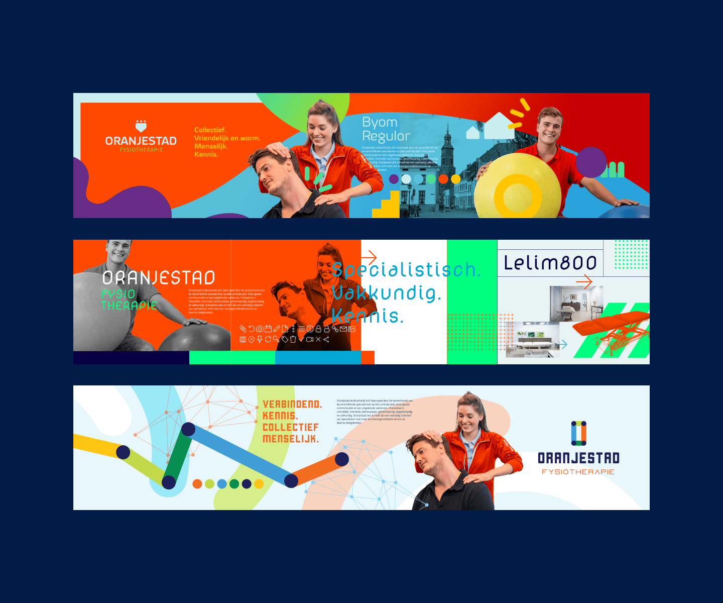
2 - Colors
Colors can be applied to typography. But typography not by color.
That is why a color set was first designed, which is of course based on brand strategy, the frameworks, conditions and the creative concept.
In fact, the key words were translated into colours. For example, the keyword 'specialism' has been translated into a special, exceptional, 'different from the rest', bright color.
Orange was chosen as a logical reference to the name and location of the physiotherapy practice. Dark blue has been selected as a reliable counterbalance to the orange and the brighter colours. But also to display business knowledge and medical experience.


3 - Typography
Typography is extremely important in a house style and for that reason a lot of attention was paid to the Oranjestad typography. The letterforms determine the feeling that the brand should evoke in customers.
Here too, the key words from the brand strategy sessions, frameworks, conditions and the creative concept were decisive. For example, a search was made for 'specialist', 'collective' and 'connecting' typography.
Oranjestad is in the middle of the community in Buren, does not feel elevated at all, is far from a fancy spa or wellness institution and should therefore not use a very heavy or very light and thin font. Matching the logo.
Written quickly give the font a too classic or too technical appearance. Schreefloos is modern, up-to-date and thus fits in with the relatively innovative and specialist attitude of Oranjestad.
The Exo2 font selected for the longer texts is a Google Font, which means that using this house style font will be much easier in digital resources, such as headers in a website.
4 - Shapes and graphic patterns
Shapes in the visual expressions of the brand can be anything. From areas in which text is placed to graphic patterns.
For Oranjestad, the pivot points of a body were visually represented by dots. This polka dot pattern became a defining shape in the corporate identity. The creative concept of 'connecting' was implemented in the house style by connecting the dots with a graph line. This stands for the progress that patients make with treatment by Oranjestad Physiotherapists.
5 - Image concept
The Image Concept lays down how images are handled in general. It is determined whether an image is always photographic, or whether illustrations are also appropriate. Photography can always be edited in a way (colors, angle at which photos are taken, subjects) that makes it easier to recognize the brand.
A predominantly photographic image has been chosen for Oranjestad because the people in the photo must also remain recognizable for patients. A realistic representation of the treatment is important for customers. It's nice to have the same physiotherapist you saw on the website in the morning. to be able to shake hands in the afternoon during the introduction.
6 - Animation
In 2022, video and animation have become an integral part of the digital landscape. That is why, at the request of the customer, we think about how movement can contribute to the recognisability of the brand.
No animation has yet been developed for Oranjestad.
Step 6 - Application Design
After completing the corporate identity design, we started applying that corporate identity in various applications. Not every designer does this.
However, it has two important advantages:
First of all, the designer can test whether the designed house style can be used in special media. A beach flag, for example, has a special long narrow shape that can be printed. While an email signature banner has such a small surface that a logo must still be legible and recognizable.
In addition, the customer can be shown what the new house style looks like on all kinds of products and house style carriers. It proves that the design is not just beautiful. But that too has been thought about the functioning and practical usefulness of the design.
Ultimately, the following corporate identity applications were designed for Oranjestad:
Responsive website
Printing
Writing paper
Business cards
C5 envelopes
Appointment card
Sponsor banner
Working Clothes


Related projects

NWO Synergy 2021 event – Design main illustration and Event Identity Design
NWO Synergy in 2021 was different from other years. Synergy is an annual event of the Dutch Research Council (NWO). In 2021, due to the COVID19 pandemic, it was held completely online…
Westerpop Delft Free Music Festival - 25th anniversary Event Identity Design
Westerpop is a free music festival in Delft, the Netherlands, every two years. In 2009 it celebrated its 20th anniversary as a festival. Mr. Upside was asked to provide the brand identity design and…
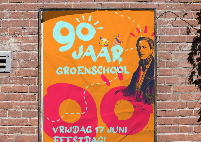
Groen van Prinstererschool 90th Anniversary Year Event Identity Design
In the 2021-2022 school year, the school celebrated its 90th anniversary. In February 2022, Mr. Upside was asked to provide the logo and visual communication for the 90th anniversary...