Mr. Upside x Multizorg VRZ
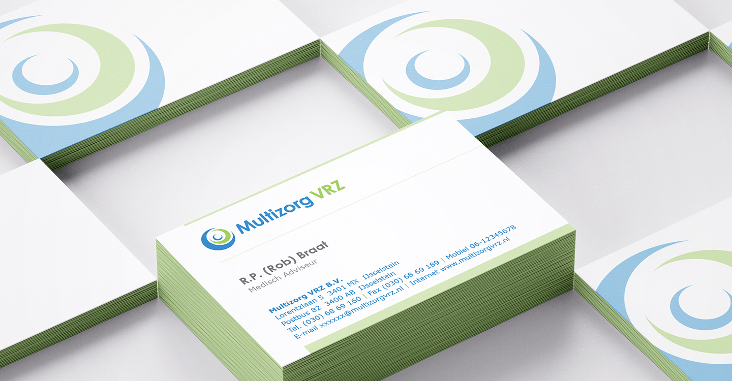
Multizorg VRZ manages healthcare procurement and contracting for various Dutch health insurers in a professional manner. It provides national healthcare procurement and contracting for health insurers a.s.r., ONVZ, Eno and Zorg en Zekerheid. Quality, price and accessibility of care are central to this. Mr. Upside was asked to design the corporate identity and collateral.
Client(s)
Services delivered
Brand Identity Design
Visual Communication Design
Art Direction
Communications Consultancy
The healthcare sector has a fairly uniform image in the Netherlands, but also internationally. Fresh colours such as blue and light green are often used. Because Multizorg VRZ focuses on bringing health insurers together, it is not necessary to 'swim against the current' or to stand out. Conventions in communication where precisely the goal here. Not something to be avoided.
Businesslike, sleek appearance
And despite the fact that care revolves around people, it is a human service after all, Multizorg wanted a businesslike, sleek appearance. In order not to go overboard with the business look, the logo has been deliberately kept round and friendly.
Reliability and predictability
Desirable predictability
The same applies to the design language in the logo and the typography. Reliability and a certain degree of predictability are desirable in this case.
Solid typography
That is why we have chosen a capital letter 'M' that stands firmly with both feet on the ground. Also, the space between the letterforms (spacing) has been kept limited to ensure a compact, sturdy and solid appearance. The 'z' has been kept matter-of-fact and sharp and the design language of the 'o' and the 'g' is comparable to that of the logo; completely round.
Embrace
That is why the logo is made up of basic shapes; the embracing circles. The circles represent the collection of elements (health insurers). The icon is also an abstract representation of people who provide care; the caregiver who helps and metaphorically “embraces” another caregiver.
Related projects
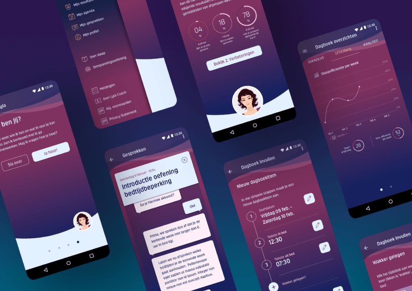
UX/UI Design Android App Lyla Coach Sleep improvement app
A 'Conversational UI (User Interface)' formed the core of the Lyla Coach sleep app. Sleep (and falling asleep) is not a natural part of every day for many people. The Lyla…
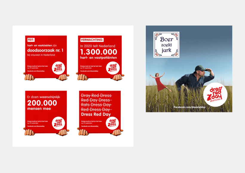
Social Media images design for De Hartstichting
The Dutch Heart Foundation wants more people to survive a cardiac arrest. That is why they invest a lot of money in research. And they are committed to learning…
V&A Advocaten Insurance Law Firm Brand Identity Design
V&A Advocaten advises on Dutch insurance and liability law. When the Rotterdam law firm started, a new brand identity was needed. They approached Mr. Upside for the design.
